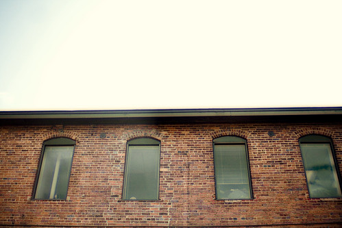
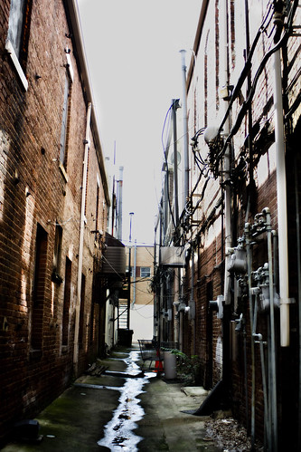
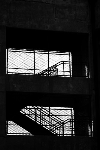
I had to make a poster for RENT the musical for my Graphic Design class so I went around a little town square nearby to shoot the gritty looking alleys and walls. I ended up taking some pictures of some interesting and textured sides.
Here's what came out of my mini adventure.
Subscribe to:
Post Comments (Atom)

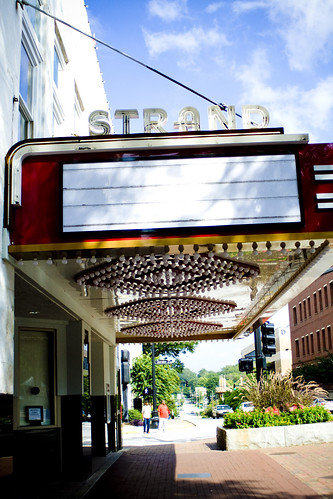
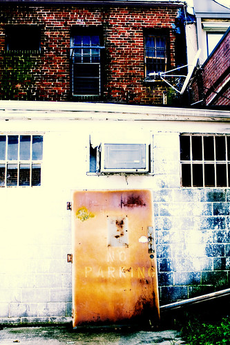


Oooh, the theater one is so pretty. Do you use color enhancement? I also love the last. It's gorgeous.
ReplyDeleteI love the photos.
ReplyDeleteWill you please post the poster when you finish??
I would love to see it! I'm a Photoshop junkie :)